
DATA ALERT: The Safety Gap in London’s Streets (2004–2026)
Why This Story is Trending Now
Public anxiety regarding London’s safety has reached a 20-year high. According to Google Trends, search interest in "London crime" and "London safety" surged ten-fold in mid-2025 and remains at this unprecedented level. SafeAreasLondon.com is the first independent response to this massive public demand for granular, honest data.
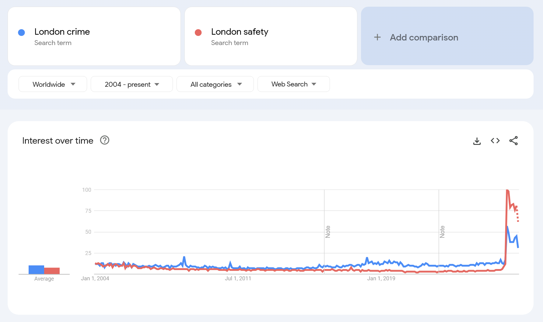
Google Trends Chart 2004–2026: The 10x Spike in Safety Concerns
Why this matters to residents and visitors:
People need clear answers to practical questions — how safe is a specific area where they live or plan to live, how far they must walk to public transport, and how two locations compare. Official police maps rarely allow this: data is either aggregated too broadly, presented in a way that distorts risk, or lacks the tools needed for meaningful comparison. SafeAreas solves this by showing location‑based street‑level risk in a format ordinary users can understand.
The Investigation: Why Official Police Maps Mislead the Public
Official crime data (Police.uk) is designed for administrative record-keeping, not for the person walking home at night. We have identified a significant "Utility Gap" in how public safety is reported.
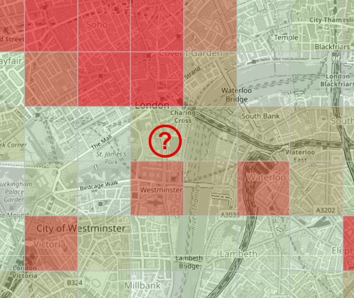
We’ve applied a professional 0.3x0.3 mi (500×500m) spatial grid across all of London, using a full year of Metropolitan Police data (2025). By weighting incidents by severity and normalising them by area, we reveal the "hidden geography" of the city.
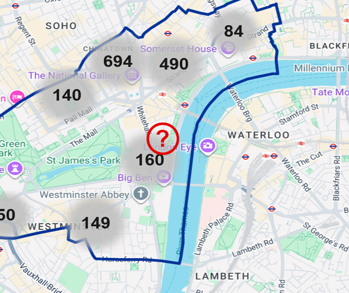
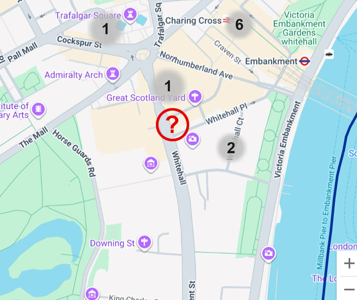
Comparison 1 — St James’s: Police.uk "Circles" vs. SafeAreasLondon.com "Grid Intensity"
Comparison: Police.uk Official Map vs. the SafeAreasLondon.com Crime Map
1. Police.uk visualizes crime only month‑by‑month, which makes the data highly susceptible to noise — seasonal effects, holiday spikes, and random fluctuations — and prevents any reliable assessment of the area’s overall crime situation.
SafeAreasLondon.com Crime Map presents annualized data, fully eliminating seasonal and holiday distortions.
2. Police.uk displays only point‑level incidents clustered together, offering minimal analytical value for understanding the crime intensity of a given area.
SafeAreasLondon.com provides a 500×500‑meter analytical grid at all zoom levels, with a calculated crime index that incorporates both the number and severity of incidents and is normalized by area. At higher zoom levels, we additionally show all individual incident points.
3. Police.uk clusters incident points, making it impossible to visually inspect a specific location at medium zoom levels; and at maximum zoom, the user loses any sense of the broader spatial context.
SafeAreasLondon.com does not cluster incidents — points become visible already at medium zoom, while the analytical grid remains available at higher zoom levels to preserve the overall spatial picture. Relying solely on clusters and points, Police.uk fundamentally cannot support visual comparison of crime levels between areas, whereas the SafeAreas grid allows direct comparison of any small segments on the map.
4. Police.uk aggregates data only by borough boundaries, meaning you lose visibility into crime on the next street if it happens to fall into a different administrative area.
SafeAreasLondon.com displays data across the entire visible map extent, so if the location you care about sits near a borough boundary, you still see the full crime context on adjacent streets.
5. Police.uk treats all crime categories as equal — meaning 100 pickpocketings and 100 violent assaults contribute identically to the index, which further distorts the perceived severity of risk inside the clustered circles.
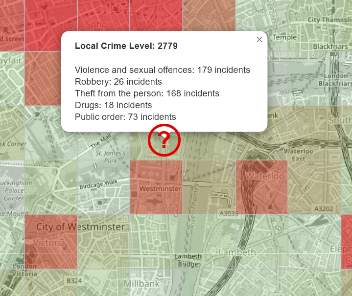
SafeAreasLondon.com calculates the Local Crime Level by multiplying the number of incidents by their severity value, producing a realistic intensity score for each area.
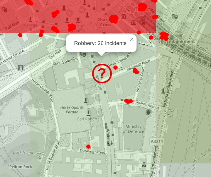
Comparison 2 — Robbery-only Intensity
When we calculate our Crime Level indicator, we don’t think in terms of administrative statistics — we think in terms of real‑world probability and the severity of consequences for a person who might encounter crime on that street.
Expert Commentary: From the Founder
Anthony Nick, an independent analytics expert with 25 years of experience in real estate and travel data (and whose early tools anticipated Google Analytics’ "User Flow" by four years), provides a unique perspective on urban data:
How the Idea Originated
The roots of SafeAreas go back to Anthony’s first trip to the United States in 2012. While choosing a hotel in New York — and aware of the city’s reputation for street crime — he searched for a clear, data‑driven way to understand neighbourhood safety. He found a NYPD crime‑point map and a heatmap of housing prices, and noticed a strong correlation between them. But there was no user‑friendly crime heatmap. More than a decade later, when he revisited the idea, such user-friendly maps still didn’t exist — not for New York, nor for London, Paris, or Berlin. That persistent gap became the foundation of SafeAreas: a project built to reveal the hyperlocal safety patterns of the world’s major cities.
"Official maps show a snapshot; we show the DNA. A monthly report is like judging a climate by one rainy day. By stripping away seasonal noise and focusing on a year-long grid, we find the persistent patterns that define a street’s character. For a tourist or a renter, this 'Digital Compass' is no longer a luxury—it's a basic requirement for personal safety."
Ready-to-Publish Story Angles
1. Why official crime maps fail users — even when they publish street‑level data London and New York do publish incident‑level crime data. The problem is not secrecy — it’s usability. Clustering, monthly noise, lack of spatial aggregation, equal weighting of all crime types, and poor UI/UX make it nearly impossible for ordinary people to compare two locations or understand real‑world risk. SafeAreas uses the same raw data but applies proper normalization, severity weighting, and a clear grid‑based map that reveals what official tools hide through design limitations, not intention.
2. The Inequality of Safety: Our analysis shows that London’s most vulnerable communities face disproportionately higher street‑level risk, even when borough‑level statistics suggest stability. Hyperlocal data reveals a city where safety can change dramatically within a few minutes’ walk. (The Guardian)
3. The Hidden Variability of Risk: Crime intensity in Central London fluctuates by up to 300% between adjacent 500‑metre blocks. This granular view exposes structural blind spots in official reporting and challenges long‑held assumptions about “safe” and “unsafe” districts. (The Times)
4. The Safety Premium Exposed: Several high‑value postcodes — including areas with luxury retail and diplomatic presence — show elevated incident intensity that contradicts their market reputation. For investors, insurers and corporate travel planners, borough‑level data is no longer sufficient. (Financial Times)
5. London’s Hidden Hotspots: When isolating robberies, SafeAreasLondon.com uncovers high‑risk corridors around nightlife zones and transport hubs — patterns that remain invisible on Police.uk’s cluster maps but shape the everyday experience of Londoners. (Evening Standard)
6. Two Streets, Two Different Londons: Our map shows that two hotels just 200 metres apart can expose visitors to completely different levels of danger — a stark warning for families, tourists and anyone relying on official crime maps. (Daily Mail)
Media Assets & Contact
We provide journalists with high-resolution heatmaps, custom data exports for specific neighbourhoods, and expert commentary on spatial crime distribution.
Attribution: “SafeAreasLondon.com – independent analysis of 2025 Metropolitan Police crime data (Local Crime Level Index, 0.3x0.3 mi (500×500m) grid).”
![]()
Anthony Nick, contact: емаil
Anthony Nick is an Independent Analytics Expert with over 25 years of experience in architecting complex digital systems for the Real Estate and Travel sectors. A veteran entrepreneur since 2002 (founding VividWay LLC in San Diego, CA), Anthony has a long history of out-innovating industry giants. His proprietary analytical tools "User Trails" pre-dated "User Flow" features in Google Analytics by four years. In recent years, Anthony has operated as an independent consultant, advising businesses on high-stakes data architecture and growth. "Safe Areas" Project is the culmination of this expertise—applying professional-grade spatial analysis to improve public safety for everyone.